1600×900 — key screen, product shot, or research-in-action photo
ExplorationUX ResearchTrust & CRO
Case Study
Closing the trust gap on second-hand retail
Project walkthrough
Work in progress — this study is still being built
An independent investigation into how trust, condition transparency and reassurance mechanisms shape purchasing confidence in second-hand e-commerce — 8 participants, 2 cohorts, and a competitor benchmark, translated into 5 recommendations that ship within CeX's existing design language.
Research snapshot
RoleSole researcher and designer — recruitment, sessions, synthesis and the redesign concept
Duration5 weeks
TeamIndependent, self-directed
Participants8 total, two cohorts of 4. Cohort A had bought refurbished electronics before; Cohort B had considered it and chosen not to. Recruited through Discord gaming communities — members are active consumers of games and technology, which makes the channel well matched to second-hand electronics purchasing behaviour.
MethodsSemi-structured interviews with think-aloud walkthroughs of the live PDP · affinity mapping in Dovetail · heuristic evaluation of the current page · competitor benchmarking against comparable refurbished marketplaces
Research questionsWhat specifically stops someone who wants a cheaper console from buying one? Is the barrier informational or motivational — and if informational, where exactly does the information need to sit?
Constraints & limitationsNo access to CeX analytics, conversion data or production metrics — no result here is measured, and no uplift is claimed. Sample of 8 is qualitative and directional: it identifies mechanisms, not magnitudes. Recommendations are constrained to CeX's existing design language, since a concept requiring new components is less likely to ship.
Independent investigationIndependent research on a public product. No client brief, no analytics access, no commercial validation.
Behaviour observedResearch complete · n=8Hypotheses framedDesign response proposedAwaiting validationAwaiting production data
Why this investigation matters
A category where the discount is the problem.
Second-hand electronics is one of the few categories where lowering the price can reduce the likelihood of purchase. A cheaper console reads as a riskier console, so the saving has to be explained rather than displayed.
That makes it a genuinely interesting problem: the obvious lever is already at its most aggressive, and pulling harder makes things worse.
Research sample
COHORT A · 4
Refurb buyers
COHORT B · 4
Considered, didn't buy
8
Participants · 2 cohorts
Problem
Condition uncertainty blocks the decision
Grade labels like "Good" or "Excellent" were interpreted differently by almost everyone interviewed — without a shared definition, evaluation stalls before the decision stage.
Solution
"Tested & Verified" badge above the CTA
Responds to: Trust sought externally
The problem
A discount that made people suspicious.
Price was never the objection. The absence of a reason to trust the price was.
Second-hand electronics carries a persistent trust gap: buyers can't inspect the product, and grading systems read as opaque.
The research question
Narrow on purpose — what specifically stops someone who wants a cheaper console from buying one?
How recruitment answered it
Cohort A had bought refurbished before. Cohort B had considered it and chosen not to.
Why Cohort B mattered most
People who already buy second-hand have resolved the trust question. Only the group still holding the objection can explain it.
Discover & Define
What participants revealed — and how confident I am in it
Seven of eight couldn't interpret the condition grades — and were confidently wrong about them.
7/8
participants affected
Condition uncertainty blocks the decision
Grade labels like "Good" or "Excellent" were interpreted differently by almost everyone interviewed — without a shared definition, evaluation stalls before the decision stage.
Yeah, something I can't tell from pics.Participant 03 · Cohort A
Behavioural principleAmbiguity aversionPeople avoid options with unknown odds, even when the expected value is better. An unexplained grade is an unknown risk, so the safer choice is not to buy.
High confidence · consistent across both cohorts
6/8
left the page to verify
Trust is sought externally, not surfaced internally
Participants left the page to check reviews, seller reputation and warranty length before committing — reassurance the PDP itself wasn't proactively offering.
Yeah, online as well — but I always check reviews and ratings.Participant 06 · Cohort B
Behavioural principleUncertainty reductionWhen a seller controls the message, buyers seek verification elsewhere. Every exit to a third party is a moment the page could have owned.
High confidence · observed behaviour, not self-report
4/8
weighed saving vs. risk
"Is the saving worth the risk?"
Price wasn't the objection — the absence of a convincing reason to trust the saving was. Without context, a discount reads as a warning sign rather than a reward.
May be low, but it makes you think — for what reason?Participant 06 · Cohort B
Behavioural principleLoss aversionA potential loss weighs heavier than an equivalent gain. The risk of a faulty console outweighs £100 saved — so the discount has to be explained, not just displayed.
Medium confidence · concentrated in Cohort B (considered, didn't buy)
The change
Moving reassurance to where the doubt happens.
The information already existed on the page. It was just nowhere near the hesitation.
ABOVE THE FOLD — current live page vs. redesign concept (zero-scroll constraint, 1440×900)5 changes
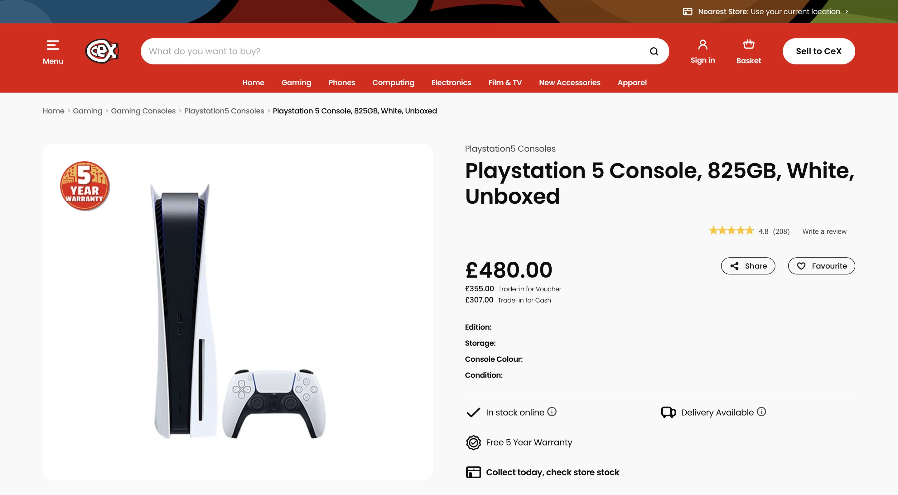
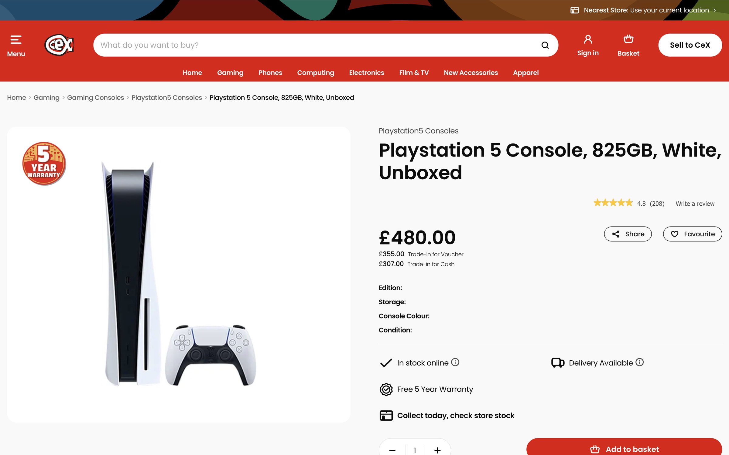
Control — current live CeX PDP
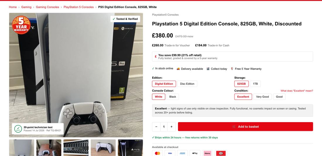
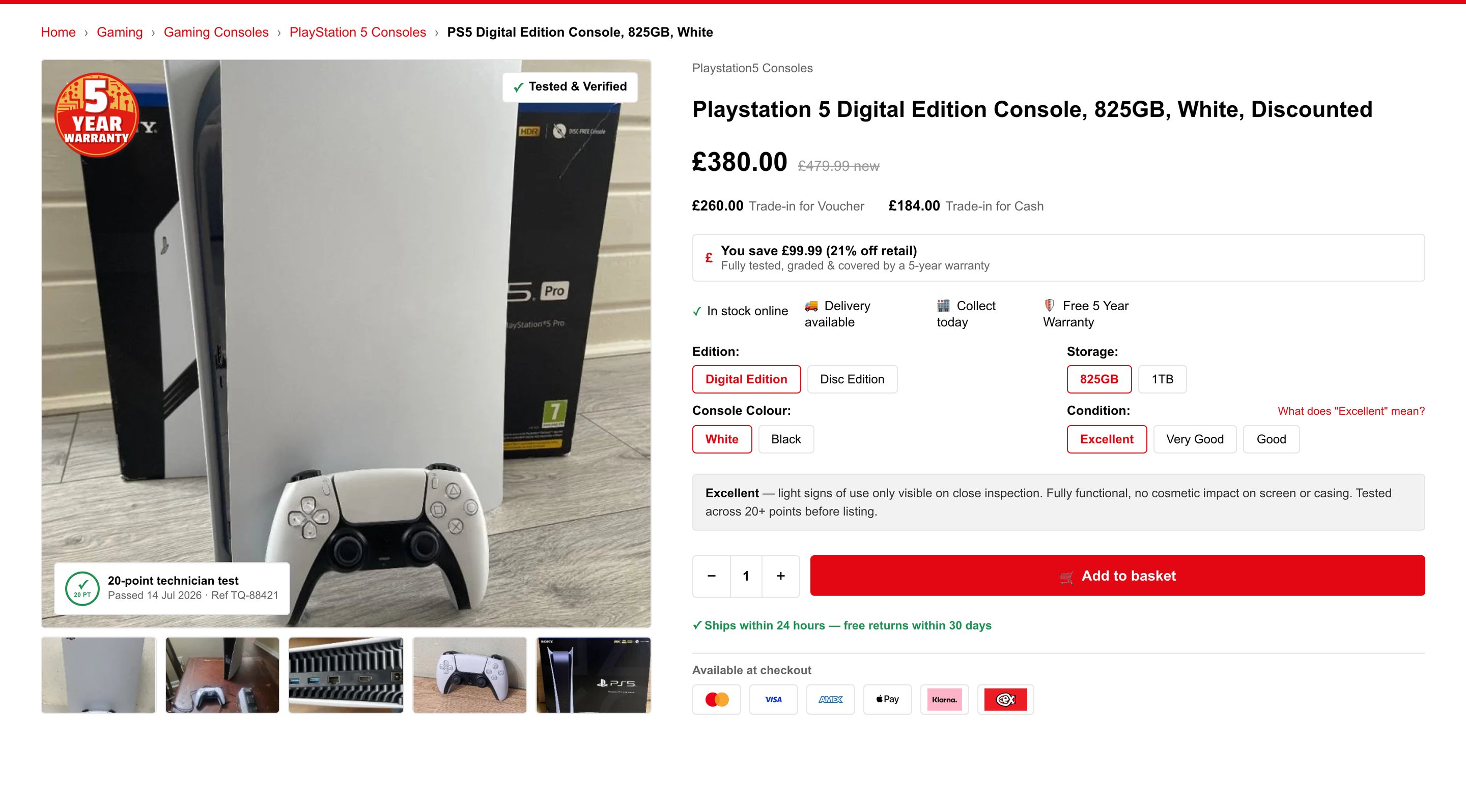
Concept — trust signals surfaced above the fold
What changed & why
01
Smart savings banner
Contextualises the saving against retail price — 4 of 8 described a "is the saving worth the risk?" calculation.
02
Condition grading inline
Grade explanation shown as descriptive text, not behind a tooltip — 7 of 8 couldn't assess condition from the label alone.
03
Multiple product angles
Real device photos in the gallery so users can see condition rather than imagine the worst case.
04
"Tested & Verified" badge
Moved above the CTA — verification messaging previously sat below the fold at 1440×900.
05
Payment marks at the CTA
Familiar providers surfaced next to the buy action to reduce final-step hesitation.
BELOW THE FOLD — supporting detail4 changes
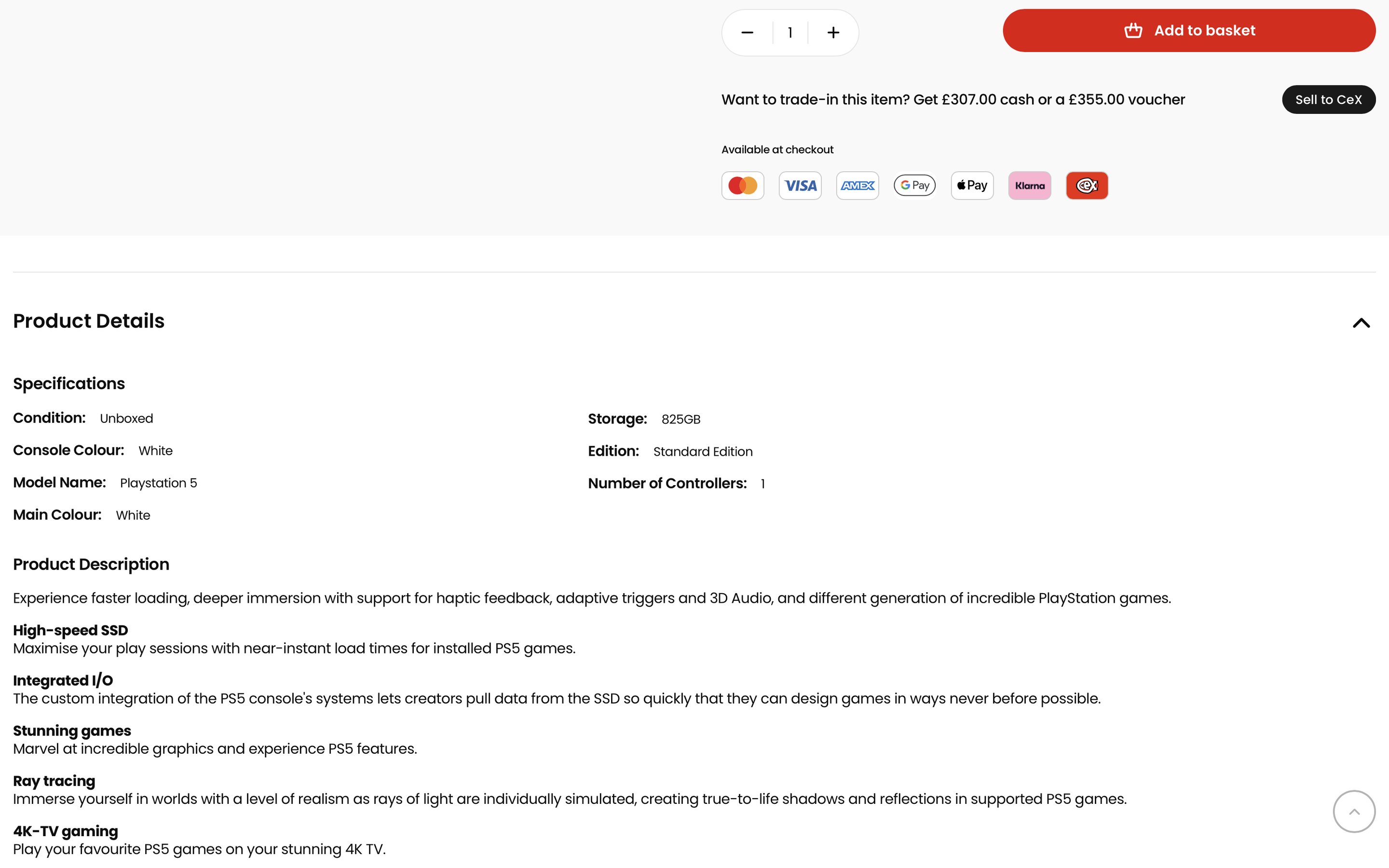
Control — current live page
Concept — reassurance carried through
What changed & why
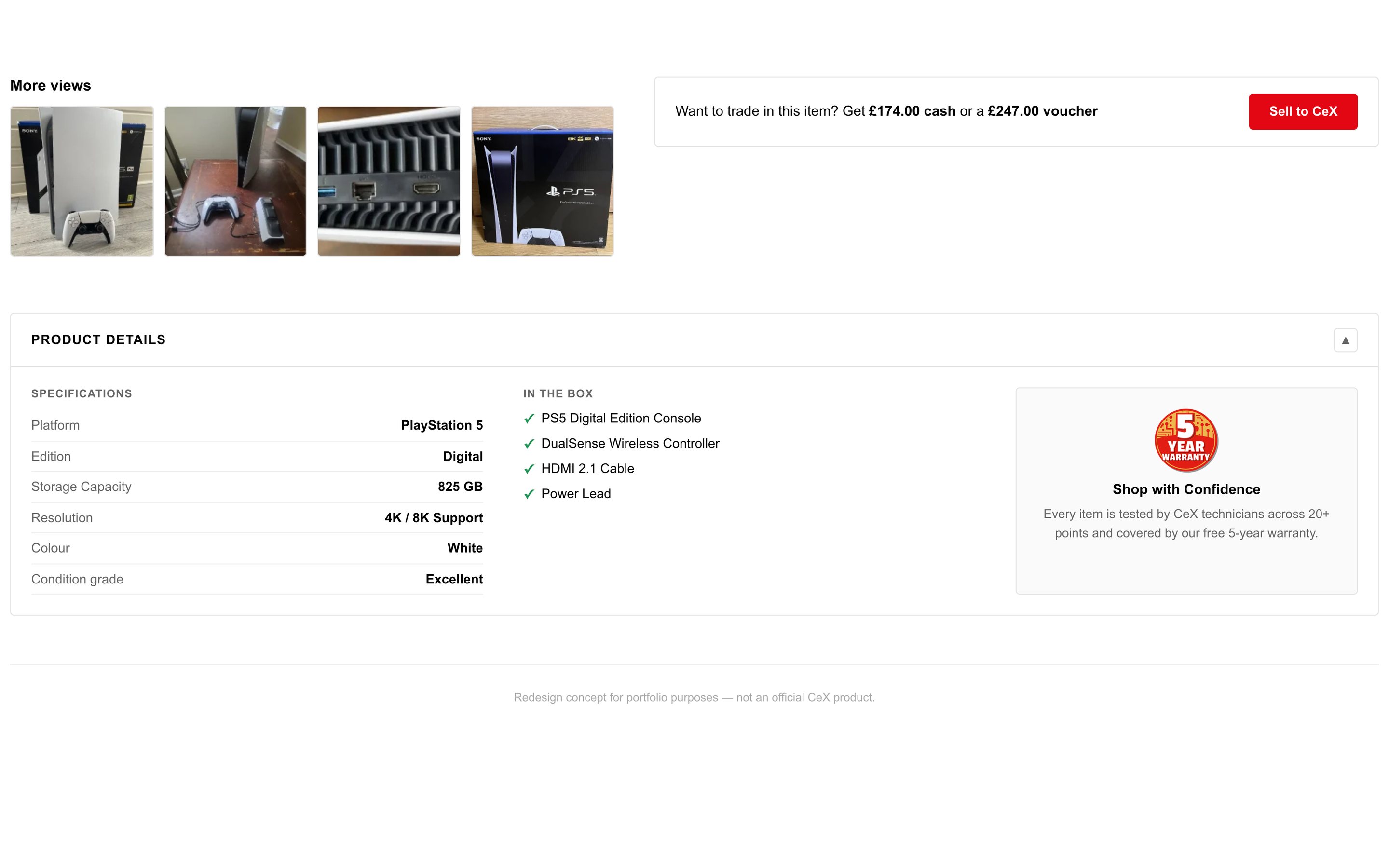
06
Specifications made comparable
Platform, edition, storage, resolution and condition grade set out as a scannable table rather than buried in prose — so a buyer can check the spec without reading a description.
07
What's actually in the box
Console, controller, cable and power lead listed explicitly. Second-hand buyers can't assume completeness, and this was a recurring question in sessions.
08
Warranty restated at the decision point
The 5-year warranty and 20-point technician test appear again below the fold, where people were still weighing the risk rather than at the top where it's easily missed.
09
Trade-in value kept visible
The sell-back figure stays on the page, reframing the purchase as partly recoverable — which changes the risk calculation rather than the price.
The recommendations
Five changes, all shippable inside the existing design system.
Constrained to existing components on purpose — research that can't ship doesn't count.
3 findings → 5 decisions → 3 win criteriaeach change answers a specific research finding
D1← Trust sought externally
"Tested & Verified" badge above the CTA
D2← Condition uncertainty
Grade explained inline, not behind a tooltip
D3← Price vs. risk calculation
Savings framed against retail price
D4← Condition uncertainty
Multiple product angles in the gallery
D5← Residual checkout hesitation
Payment logos surfaced at the CTA
Trade-offs
Why this solution, and what it cost
D2
ChoseGrade explanation shown inline as descriptive text.
Considered insteadA tooltip or modal — tighter layout, and the pattern most marketplaces use.
Why this wonTooltips require the user to suspect there's something to learn. Seven of eight didn't know the grade was ambiguous — they were confidently wrong.
What it costVertical space above the fold, the scarcest resource on this page.
D3
ChoseSaving framed against original retail price.
Considered insteadA simple percentage-off badge — lighter and more familiar.
Why this wonA bare discount reads as a warning in this category. Anchoring against retail explains why it's cheaper, not just how much.
What it costDraws attention to price when trust, not cost, is the barrier.
D4
ChoseReal photographs of the actual unit.
Considered insteadStock product imagery — cheaper and visually consistent.
Why this wonStock imagery can't answer "what condition is this item in?" — the question people were actually asking.
What it costEvery unit needs photographing. The recommendation most likely to be rejected on cost.
Sequencing
Which test runs first, and why
Sequenced by expected impact against implementation cost. D2 and D3 address the two findings with the highest participant counts and need only copy and layout changes — they are the cheapest tests of the core hypothesis. D4 is last not because it matters least, but because photographing every unit is an operational commitment worth making only once the cheaper interventions have proven the mechanism.
Experiment
Impact
Confidence
Effort
Risk
Order
D2 Grade explained inline
High
High
Low
Low
1
D1 Verified badge at CTA
High
Medium
Low
Low
2
D3 Savings vs. retail framing
Medium
High
Low
Medium
3
D5 Payment marks at CTA
Medium
Medium
Low
Low
4
D4 Real photos per unit
High
Medium
High
Medium
5
Risks
What could go wrong, and what would explain it
Validation plan
How I'd know whether this worked
Independent research — not yet validated. Conducted without access to CeX analytics, so no conversion uplift is claimed. Each outcome below is a hypothesis with a defined validation method, requiring live A/B testing against baseline data.
Primary hypothesis
↑ ATC
Add-to-cart rate rises when condition is explained at the point of evaluation rather than left ambiguous.
GuardrailReturn rate and refund rate — honest condition detail should reduce returns. If add-to-cart rises while returns rise too, the copy is overselling, not clarifying.
Evidence required: A/B test, control vs. redesigned PDP. Add-to-cart is the decision metric; time-on-page and scroll depth read as supporting signals only — a change in either is ambiguous on its own.
Supporting hypothesis
↓ Exits
Back-navigation from PDP to search results falls once trust signals are surfaced on-page.
GuardrailOverall session depth — fewer exits to search must not simply mean fewer products viewed per session.
Evidence required: Session recording and clickstream analysis of navigation patterns away from the PDP.
Supporting hypothesis
↑ Trust
Self-reported platform trust improves against a pre-change baseline.
GuardrailSample composition — trust scores must be compared across equivalent buyer types, or the cohort mix explains the result rather than the change.
Evidence required: Pre/post survey using the same instrument and equivalent recruitment.
Next
What I'd research next
Test whether condition transparency reduces returns as well as raising add-to-cart — if honest grading lowers both, the commercial case is far stronger than conversion alone.
Run the same protocol with a larger Cohort B sample. Four participants identified the saving-versus-risk mechanism; it needs more weight before it justifies the pricing changes it implies.
Investigate whether trust transfers across categories — a buyer reassured on a games console may not need the same reassurance on a phone, where data security introduces a different objection.
Reflection
Design rationale
LOOKING BACK
What surprised me
Price was never the objection. I assumed a discount had to be justified against budget — it had to be justified against risk. A big saving actively increased suspicion.
What held, with a correction
People didn't need more information. They needed the same information where the hesitation happens. The grading explanation already existed; nobody was looking there.
What stays uncertain
Eight participants prove a mechanism exists, not what it's worth — and I haven't guessed. The finding I trust least came from four people and carries the largest commercial implication.
The constraint I set
Every recommendation ships inside CeX's existing components. Research that can't be implemented doesn't count.
These are the results that would tell me the model is wrong, rather than the test being badly run.
If this happensAdd-to-cart rises but returns rise with it.
ThenThe copy is reassuring people into purchases the product can't support. That's overselling, not clarity, and I'd pull the change rather than scale it.
If this happensExplaining the grade changes nothing.
ThenCondition ambiguity isn't the live barrier — it's something participants could articulate but weren't actually deciding on. The next round would need to be behavioural rather than conversational.
If this happensOnly Cohort A behaviour improves.
ThenI've designed for people who had already resolved the trust question. The people I was actually trying to reach are unmoved, and the recommendation is aimed at the wrong group.
The next research question
At what point does trust stop being the barrier and price start being the barrier again — and does that threshold move with the value of the item?
Beyond this case study
Every project raises questions it doesn't answer. This page covers the decisions that shaped the outcome — it can't capture the stakeholder conversations, the directions we tested and abandoned, or the trade-offs that never made it into a slide. That's usually where the most useful learning sits.
Why I recruited people who chose not to buyThe finding I trust least, and why it carries the biggest recommendationWhat real product photography would actually cost to operateHow I'd test this without access to CeX analytics