The problem wasn’t lack of intent. It was lack of confidence.
From complexity to clarity.
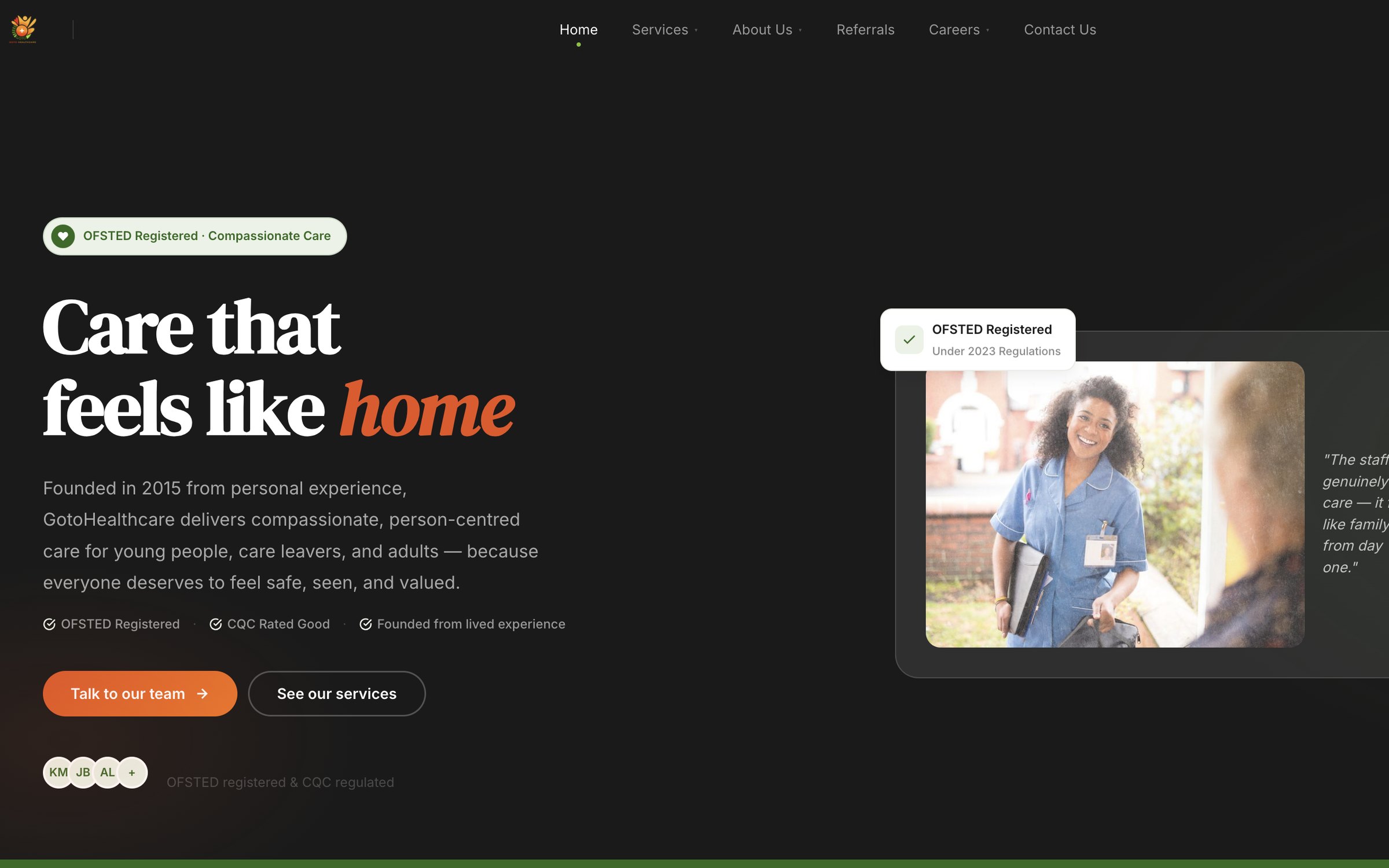
An ongoing redesign and optimisation project focused on making a complex care service easier to understand, navigate and act on.
A redesign was on the table. Nobody could say why.
Enquiries had plateaued and the client believed the site needed rebuilding. The people arriving are often deciding for someone else — every drop-off is a person who didn’t get help.
Redesign is the most expensive answer to a question nobody had tested yet.
People weren’t leaving on the contact form. They were leaving before it.
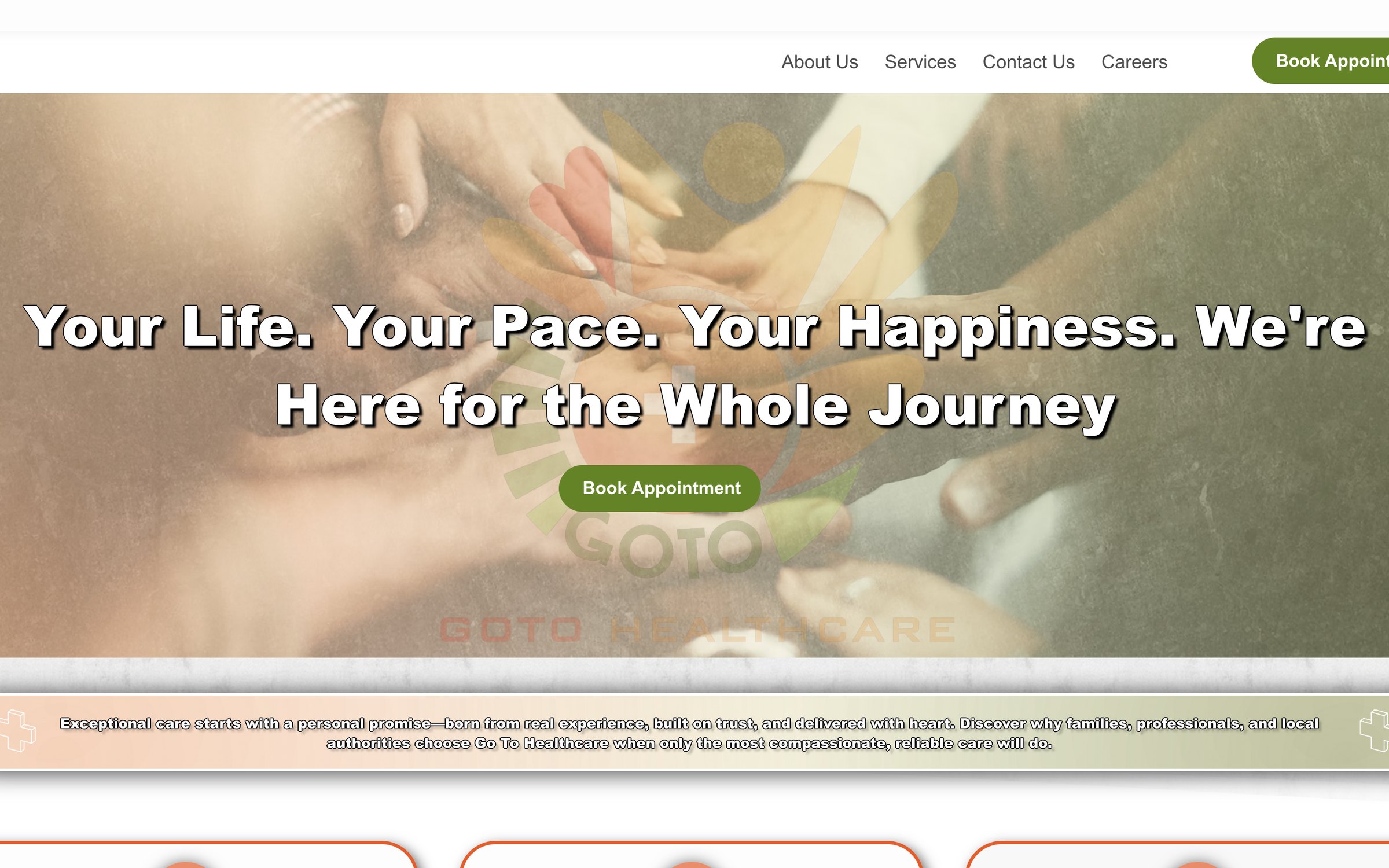
- 1ObservationThe headline described a feeling, not an offer. After 30 seconds, most participants couldn’t say what the service does.
- 2ObservationNo accreditations or testimonials visible. “It could be anyone.”
Why are users with clear intent leaving before making contact?
And the one underneath it: what would make this provider feel trustworthy enough to call?
Five lenses. Six weeks.
Live site, no staging. Small qualitative sample — directional, not significant. No CRM or referral data.
- 01Heuristic audit5 pages scored on trust, value and clarity
- 02Behavioural analyticsGA4 & Hotjar — where people actually exited
- 03Competitor benchmarkingHow other care providers earn trust
- 04Stakeholder workshopWhat the client believed, and why
- 05Moderated usability testing2 rounds · 10 participants · identical tasks
Less content, better placed.
Some of this genuinely needed rebuilding. Much of it just needed saying differently.
Influencing the decisionThe client wanted more homepage content. The research showed users were already overwhelmed. The data won that argument.
Depth3 findings → 6 decisions
- D1← Weak value propositionRewrote hero to lead with emotional benefit
- D2← 68% exit rate on ServicesRestructured Services into scannable cards with CTAs→ Largest single contributor to the drop-off reduction
- D3← Trust scored Poor on 3 pagesAccreditations and testimonials above the fold→ Trust 2.4 → 4.1; cited unprompted by 5/5 in Round 2
- D4← No CTAs on 4 of 5 pagesPrimary CTA on every page, before the scroll
- D5← Jargon flagged by 4 of 5Plain-language rewrite across all pages→ Comprehension 68s → 22s
- D6← Users couldn’t visualise the serviceContextual photography of real carers→ No measurable effect isolated — kept on qualitative feedback
Make the service easier to understand.
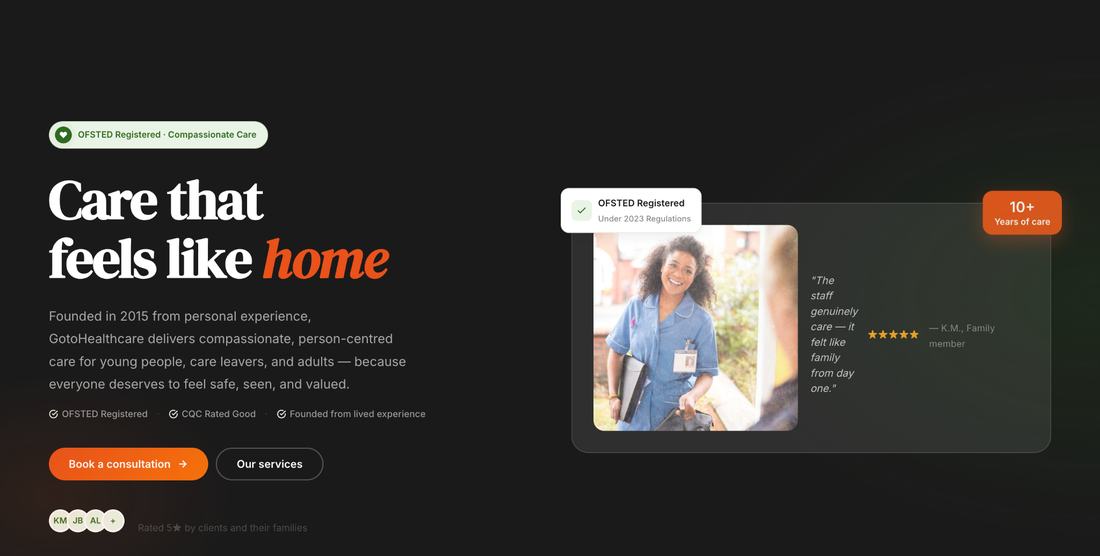
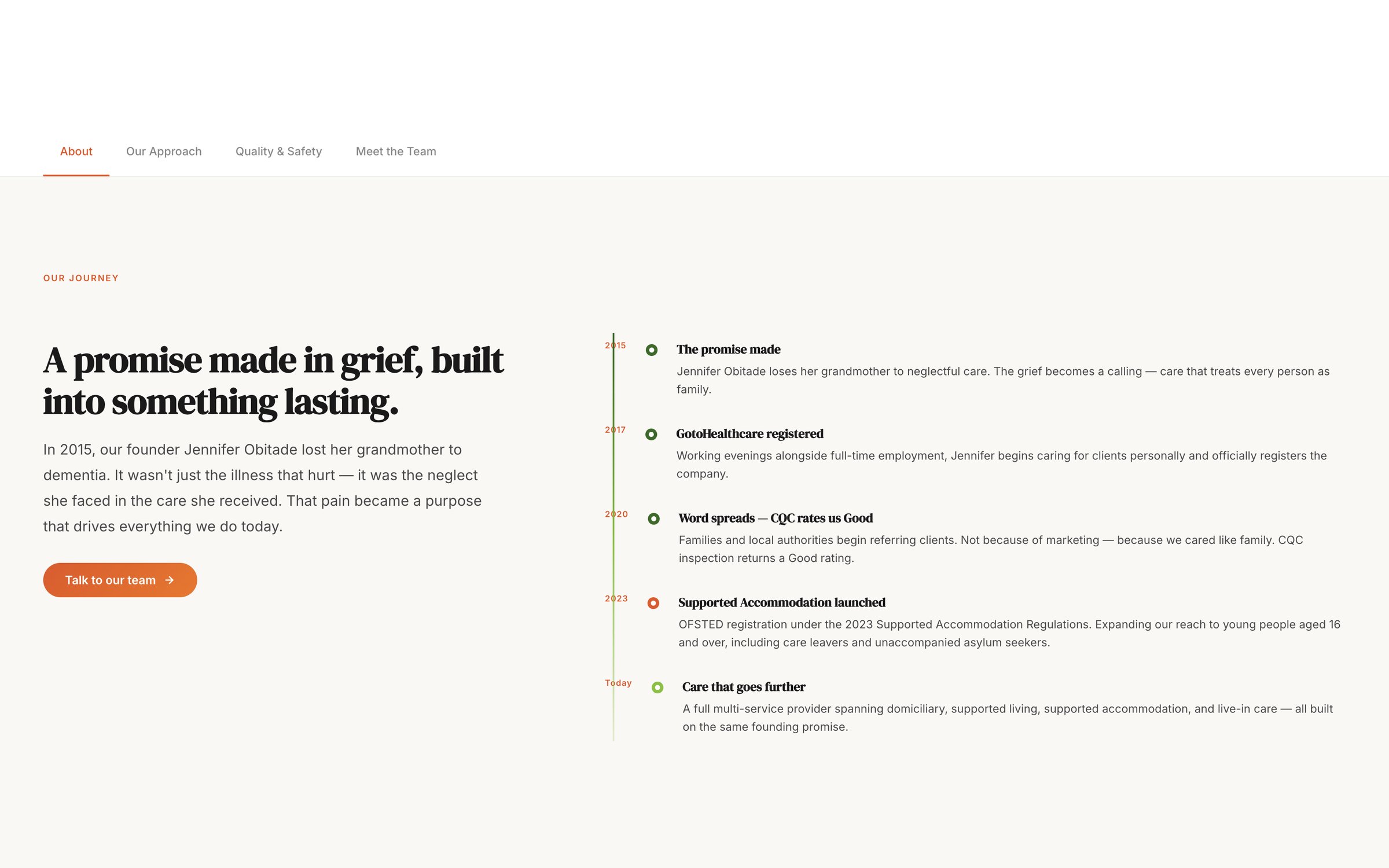
- 01 · Lead with the promise“Care that feels like home” plus who it serves — benefit before service description.
- 02 · Accreditations surfacedOFSTED Registered and CQC Rated Good moved above the fold.
- 03 · CTA before the scroll“Book a consultation” in the first viewport, with a path for browsing services.
- 04 · Plain languageClinical jargon rewritten so it reads as human.
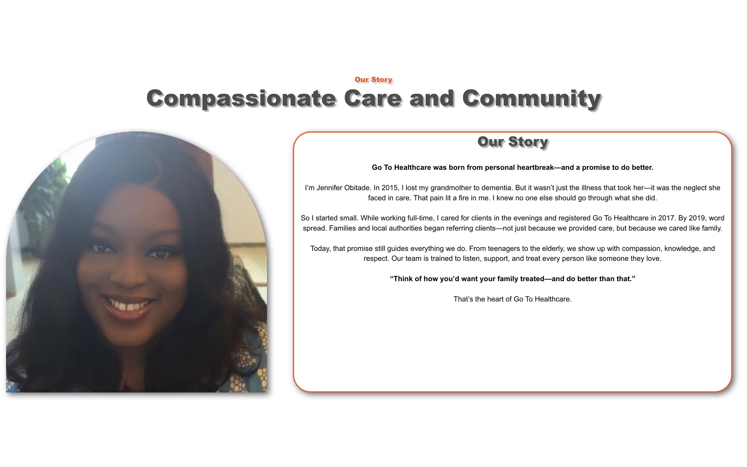
- 01 · Story keptThe founder’s lived experience stays — led by a headline, not a wall of text.
- 02 · Credentials as a gridYears of care, OFSTED, CQC and person-centred commitment, readable at a glance.
Not a one-off redesign. An ongoing engagement.
- Version 01 · 2024DiscoverInitial review, a deeper UX audit, and the structural issues behind the drop-off.
- Version 02 · 2025RedesignClearer hierarchy, improved navigation and service presentation.
- Version 03 · 2025–26OptimisePost-launch monitoring, content audit, competitor evaluation and expanded service content.
More people progressed and called — but some calls were still asking for basic service information.
New question: how can the website answer more of those questions before someone needs to call?
- Launch
- Observe
- New signal
- New question
- Optimise
Content audit · Competitor heuristic evaluation · Additional service pages · Organisation content
What the decisions moved.
Two kinds of evidence: GA4 behaviour after launch, and moderated usability testing with identical tasks — directional, not statistically significant.
The real outcome wasn’t the redesigned pages. It was knowing which parts needed rebuilding — and which just needed to say something clearer.
It would have been easy to accept the redesign framing. The first solution is rarely the right one.
Get moderated sessions with service users earlier, and agree the measurement window before starting.
Sole researcher and designer — set the research plan, ran both rounds, presented to stakeholders, and argued the content-reduction decision.