1600×900 — key screen, product shot, or research-in-action photo
ExplorationCROExperimentation
Case Study
Designing isolated experiments to fix a visibility problem
Project walkthrough
Work in progress — this study is still being built
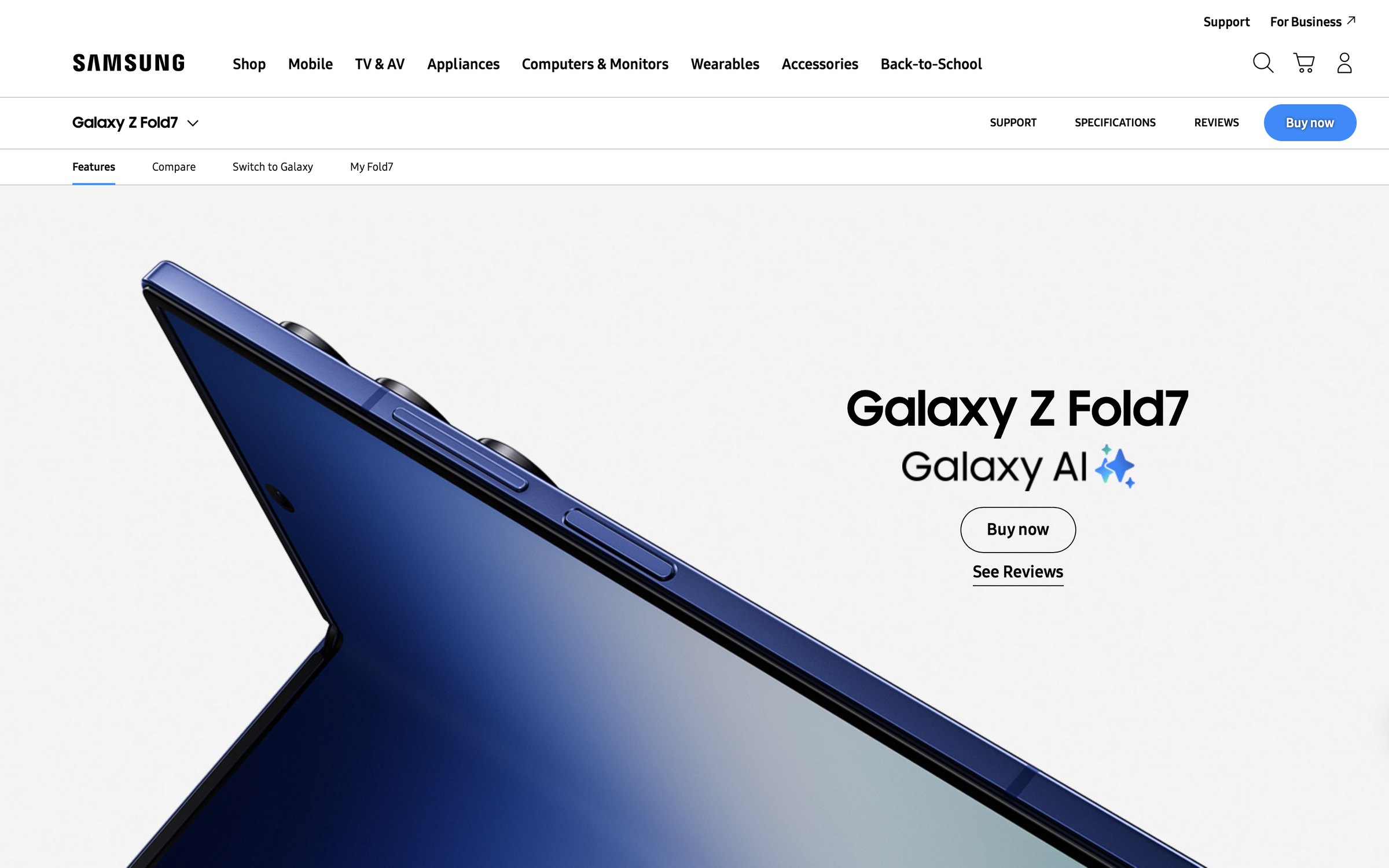
A structured A/B experimentation proposal for the Galaxy Z Fold7 PDP — four isolated tests targeting visibility, confidence and conversion above the fold. Each hypothesis is tested in isolation, so any result is attributable to one variable.
Research snapshot
RoleSole analyst — framing, hypotheses, experiment design and win criteria
Duration3 weeks
TeamIndependent, self-directed
ParticipantsNone — no user research conducted; this is a test design proposal
MethodsStructured heuristic walkthrough of the live PDP · published consumer-electronics scroll-depth benchmarks · above-the-fold pattern comparison against competitor flagship PDPs · experiment design and win-criteria definition
Research questionsIs the constraint on this page visibility or persuasion? If users are not reaching the persuasive content, which single change most reliably increases exposure — and how would we know it was that change?
Constraints & limitationsNo analytics access and no ability to run the test — figures are drawn from published industry benchmarks, not Samsung data. Scroll-depth claims are directional inference, not measurement. Every target below requires confirmation against live baseline and an MDE calculation before any test is launched.
Independent investigationE1 runs first because it addresses the constraint the others depend on. If visibility isn't the bottleneck, E2 and E3 lose their rationale — so testing it first either validates the programme or redirects it early.
Behaviour inferredBenchmarks gatheredHypotheses framedExperiments designedAwaiting baseline dataAwaiting live test
Why this investigation matters
When the content is right and nobody sees it.
A flagship PDP is one of the most heavily invested pages a consumer electronics business owns — photography, copy, comparison tools, finance messaging.
Which makes the failure mode expensive and easy to misdiagnose. If the content is never reached, rewriting it changes nothing and costs a quarter of work. Establishing whether the constraint is visibility or persuasion is the cheapest question you can answer.
Test scope
4
Isolated experiments designed
Problem
Content goes unseen
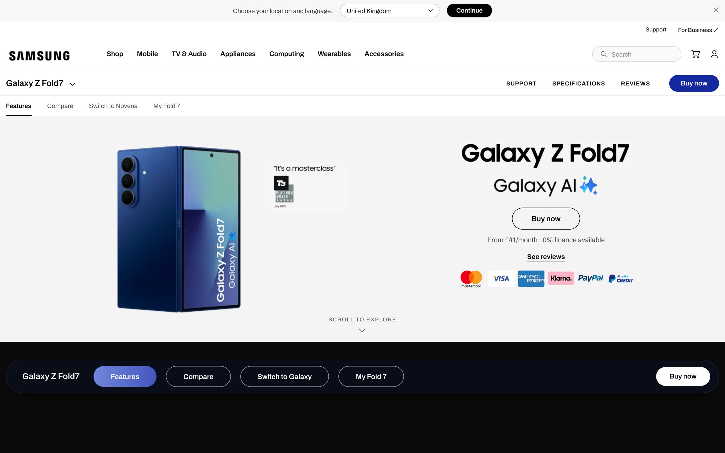
If hero height is reduced so the next section breaks the fold on load, then the proportion of visitors reaching 50% scroll depth increases by ≥10%, because a visible content edge signals depth and overrides the false-bottom effect. Basis: published benchmarks — directional, not measured here.
Solution
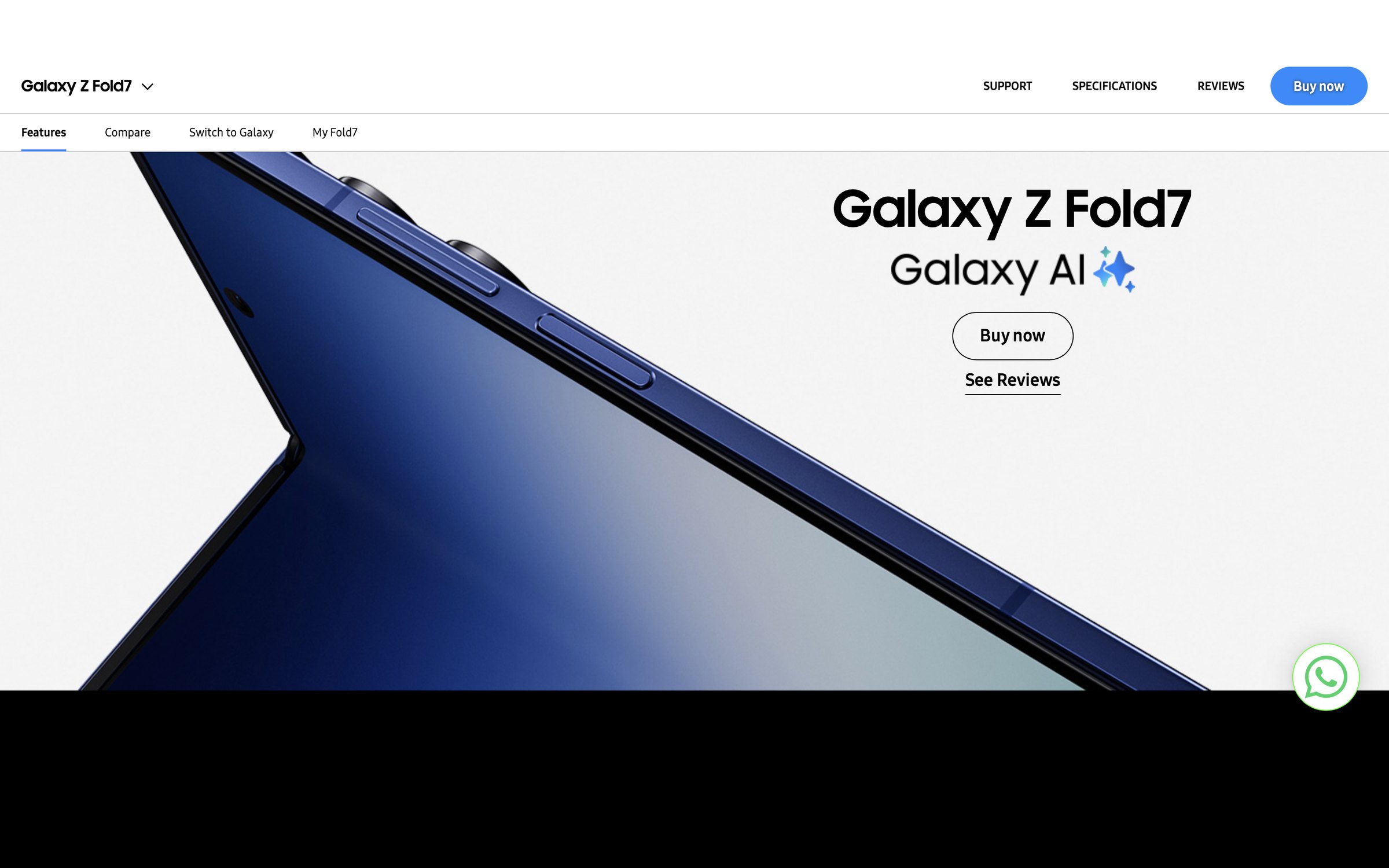
Hero reduced 615px → 430px (−30%)
Responds to: H1 · Content goes unseen
The problem
Great content nobody was reaching.
Before this looked like a content problem, it looked like a visibility problem.
The Galaxy Z Fold7 sits in a high-consideration category — a premium, unfamiliar form factor asking people to justify a significant spend.
What I had to work with
No analytics access. A structured page walkthrough plus published scroll-depth benchmarks for consumer-electronics PDPs.
What both pointed to
Exploration stalls in the first viewport, before the persuasive content is ever reached.
Why that matters
Before this is a content problem, it looks like a visibility problem — and that's an assumption worth testing rather than designing around.
Assumptions & Hypotheses
What the evidence suggests — and what it does not prove
These are assumptions with reasoning behind them — not measurements. That distinction matters.
H1
scroll behaviour
Content goes unseen
If hero height is reduced so the next section breaks the fold on load, then the proportion of visitors reaching 50% scroll depth increases by ≥10%, because a visible content edge signals depth and overrides the false-bottom effect. Basis: published benchmarks — directional, not measured here.
H2
decision friction
Decisions made blind
If product navigation and the primary CTA stay pinned at all scroll depths, then add-to-cart rate from below-fold positions increases by ≥5%, because intent forms while reading feature content and requiring a scroll back introduces friction at peak intent (Fitts's Law).
H3
confidence at the CTA
Confidence gap at the CTA
If finance availability and payment marks appear adjacent to the primary CTA, then add-to-cart rate increases by ≥5% with AOV held flat, because affordability is a primary barrier at £1,700+ and resolving it at the decision point removes a reason to defer.
The proposal
Four changes, tested one at a time.
The persuasive material was already there. The question was whether anyone saw it.
CONSOLIDATION TARGET — all four variants combined (not a live test)
Control — current live page
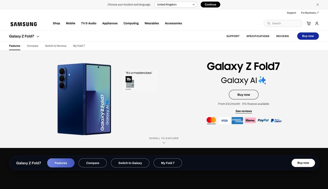
If all four win — consolidated above-the-fold standard
615px → 430px, nothing cropped — the next section now breaks the fold on load, signalling depth below.
E2
"Scroll to explore" cue
Uppercase micro-label plus animated chevron, built from existing type styles — no new visual language.
E3
Sticky product nav
Title, section links and Buy now stay pinned at any scroll depth — grounded in Fitts's Law.
E4
Payment reassurance
Finance line and payment marks sit under the CTA in existing body grey — never louder than the button above.
The experiments
One variable each, so any result means something.
Isolated deliberately. A combined redesign would tell you it worked, not why.
3 findings → 4 decisions → 4 win criteriaeach change answers a specific research finding
E1← H1 · Content goes unseen
Hero reduced 615px → 430px (−30%)
E2← H1 · Passive exploration
"Scroll to explore" cue added below the hero
E3← H2 · Decisions made blind
Sticky product nav pinned at any scroll depth
E4← H3 · Confidence gap at CTA
Finance line + payment marks at the CTA
Trade-offs
Why this solution, and what it cost
D2
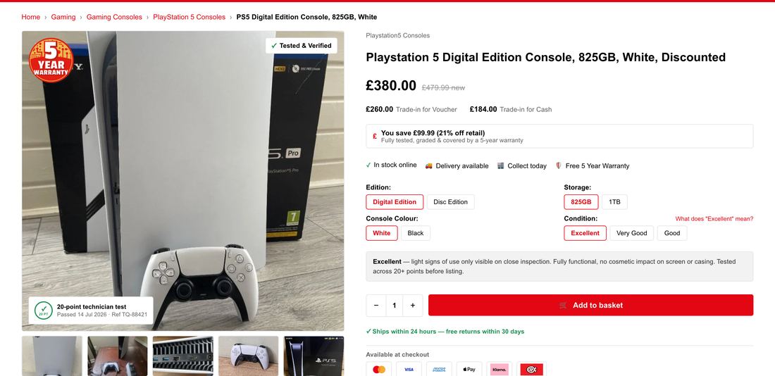
ChoseGrade explanation shown inline as descriptive text.
Considered insteadA tooltip or modal — tighter layout, and the pattern most marketplaces use.
Why this wonTooltips require the user to suspect there's something to learn. Seven of eight didn't know the grade was ambiguous — they were confidently wrong.
What it costVertical space above the fold, the scarcest resource on this page.
D3
ChoseSaving framed against original retail price.
Considered insteadA simple percentage-off badge — lighter and more familiar.
Why this wonA bare discount reads as a warning in this category. Anchoring against retail explains why it's cheaper, not just how much.
What it costDraws attention to price when trust, not cost, is the barrier.
D4
ChoseReal photographs of the actual unit.
Considered insteadStock product imagery — cheaper and visually consistent.
Why this wonStock imagery can't answer "what condition is this item in?" — the question people were actually asking.
What it costEvery unit needs photographing. The recommendation most likely to be rejected on cost.
Sequencing
Which test runs first, and why
E1 runs first because it addresses the constraint the other hypotheses depend on. If visibility is not the bottleneck, E2 and E3 lose their rationale — so testing it first either validates the whole programme or redirects it early, before traffic is spent on the wrong question.
Experiment
Impact
Confidence
Effort
Risk
Order
E1 Hero reduction
High
Medium
Low
Medium
1
E3 Sticky product nav
High
Medium
Medium
Medium
2
E4 Payment reassurance
Medium
High
Low
Low
3
E2 Scroll cue
Low
Medium
Low
Low
4
Risks
What could go wrong, and what would explain it
E1 · Hero reduction
A 30% shorter hero on a premium flagship may reduce perceived quality — the hero is doing brand work, not just navigational work.
Alternative explanationA scroll-depth increase may reflect curiosity rather than intent. That is why add-to-cart, not scroll depth, is the decision metric.
E2 · Scroll cue
Prompting scroll can increase exploration and bounce simultaneously if the content below does not meet the expectation the cue creates.
Alternative explanationScroll depth may rise while engaged time per section falls — read the two together, never scroll depth alone.
E3 · Sticky nav
Persistent navigation consumes viewport, most severely on mobile where the constraint is tightest.
Alternative explanationAn uplift may come from the CTA being permanently visible rather than the navigation being useful — segment by device before concluding.
E4 · Payment reassurance
Finance messaging can shift mix toward instalments, improving conversion while reducing immediate revenue per order.
Alternative explanationA lift may reflect seasonality or promotional overlap rather than the treatment — check the split against the same period pre-test.
Validation plan
How I'd know whether this worked
Test design proposal — not yet run. No experiment has been executed and no Samsung data was available. Every figure is an indicative target requiring confirmation against live baseline and an MDE calculation at setup. Winners declared at 95% confidence, two-week minimum runtime, one variable per test.
Win criteria · E1
≥10%
More users reaching 50% scroll depth after the hero reduction.
GuardrailBounce rate and hero engagement — a shorter hero must not cost brand impression.
Evidence required: Scroll-depth tracking, 1:1 split, single variable. Scale if met and guardrails hold; iterate if scroll rises but add-to-cart does not.
Win criteria · E2
≥8%
Increase in scroll initiation within the first 10 seconds after adding the scroll cue.
GuardrailBounce and time-on-page — prompted scroll must not become prompted exit.
Evidence required: Scroll-initiation events. Kill if bounce rises — the lowest-value test in the set.
Win criteria · E3
≥5%
Add-to-cart uplift from below-fold positions with persistent navigation.
GuardrailMobile conversion and scroll depth — viewport cost lands hardest on small screens.
Evidence required: Add-to-cart by scroll position, segmented by device. Desktop-only if the mobile guardrail fails.
Win criteria · E4
≥5%
Add-to-cart uplift from payment reassurance at the CTA.
GuardrailAOV and cash-vs-finance split — gains must not be funded by revenue per order.
Evidence required: Add-to-cart rate, AOV monitored. Scale if AOV holds within 2%.
Next
What I'd research next
Moderated sessions with high-consideration buyers to test whether the confidence gap is affordability, form-factor unfamiliarity, or both — the current hypotheses cannot separate them.
Session recordings and scroll heatmaps on the live page to replace benchmark inference with observed behaviour before any test is launched.
If E1 and E3 both win, a follow-up test on whether the effects are additive or overlapping — running them together risks attributing one result to two changes.
Reflection
Design rationale
LOOKING BACK
The honest limitation
A test design proposal, not a redesign. I couldn't measure this page — only infer from published benchmarks and a structured walkthrough.
What surprised me
How much persuasive content already existed. Not a content gap, an exposure gap — cheaper to fix and easier to test.
My weakest assumption
That scroll depth predicts intent. It may only measure curiosity, which is why every win criterion resolves to add-to-cart.
If results are inconclusive
The constraint is persuasion rather than visibility, and the next step is qualitative research — not another layout test.
The hypothesis rests on scroll depth predicting intent. These are the outcomes that would undermine it.
If this happensScroll depth rises, add-to-cart doesn't move.
ThenScroll measures curiosity, not intent. Visibility isn't the constraint and the remaining experiments lose their rationale — the next step becomes qualitative, not another layout test.
If this happensThe shorter hero reduces conversion.
ThenThe hero is doing brand work I under-weighted. On a premium flagship, perceived quality may matter more than exposure to the content below.
If this happensMobile results contradict desktop.
ThenThe false-bottom effect is device-specific, and treating it as one behaviour was wrong. Everything would need re-running per device class.
The next research question
Does the false bottom hold when the buyer already knows the product — or is it only a problem for people encountering an unfamiliar form factor for the first time?
Beyond this case study
Every project raises questions it doesn't answer. This page covers the decisions that shaped the outcome — it can't capture the stakeholder conversations, the directions we tested and abandoned, or the trade-offs that never made it into a slide. That's usually where the most useful learning sits.
Why I'd run the hero test first, and what it would kill if it failedThe assumption I'm least confident inHow I'd handle a result that's positive but not significantWhat I'd need from a Samsung analytics team before launching